
Marco V
Editing Photos in Photoshop
Photo #1
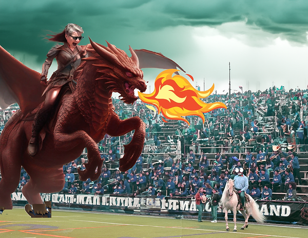
To create this image, I combined different pictures to make an exciting scene. I used an image of a Dr. White riding a dragon, a crowd of people in a stadium, and a man on a horse. I also added flames coming from the dragon's mouth to make it look more dramatic. I used Adobe Photoshop and learned to use masking, which helped me blend the pictures together smoothly. I also used AI to help generate some of the details. The image turned out really well, with everything fitting together nicely. Through this, I learned more about how to use Photoshop and its tools to create cool images.
Photo #2

I combined a scene from Dune with a cartoon version of myself using Adobe Photoshop, making it look like I’m running away from the sandworm. To create the cartoon version, I either used filters or drew over my picture, then placed it into the scene by resizing and positioning it to fit the background. The contrast between the serious, realistic desert setting and my exaggerated cartoon look made the image stand out and added humor. The mix of styles made it entertaining because they’re so different, creating a playful clash. Through this, I learned how to blend different types of visuals and how to use Photoshop to create a fun and creative image.
Movie Poster
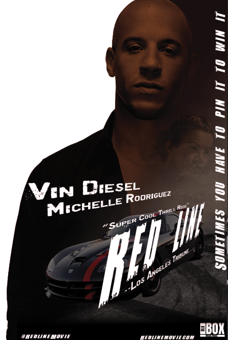
The concept for my movie poster was to create a bold and action-packed look for a high-stakes racing film. I wanted the dark color scheme and intense lighting to match the movie's gritty, dangerous atmosphere. I used Adobe Photoshop to design the poster, focusing on bold fonts and strong contrast. The lead actor is placed front and center, with a shadowy, serious look to catch attention. I also added a car at the bottom to highlight the movie's racing theme. One of the things that went well was balancing the composition between the actor and the car. I'm proud of how the bold, distressed font fits the overall tone of the movie. The lighting on the actor's face also worked out well, creating a strong focal point. However, I struggled a bit with making sure the actor's face was bright enough without losing details in the shadows. If I had more time, I would add more texture and experiment with the background to make it even more dynamic. I might also change the font for the tagline or tweak its position for a better flow. Overall, the poster captures the action and excitement I wanted, but there are always ways to improve.
Magazine Cover

I chose this person as my role model because they represent values I admire, like loyalty, respect, and perseverance, which are qualities I try to live by too. They’ve faced challenges with strength, and that inspires me to keep pushing forward, even when things are tough. The quote "You Can't See Me" stood out to me because it reminds me of the importance of staying true to myself, even when others may not fully understand me. It’s a message of resilience that really connects with me on a personal level. When designing this magazine cover, I wanted to create a clean, bold look that reflects the confidence and strength of my role model. I chose a simple background color to make the image and text stand out, so the main messages on the cover are easy to see. I used Adobe Photoshop to carefully layer each element, making sure everything looked balanced and clear. I hope the audience notices the qualities described on the cover, like strength and loyalty, because that’s what makes this person special. I want viewers to feel the same inspiration and positivity that I feel when I look up to them. My goal was to create a cover that not only looks good but also tells a story of resilience and respect.
AIM Poster

My artwork was inspired by people who hide their feelings just to keep from worrying others. I wanted to show how overwhelming and isolating that can be. The words in the portrait represent the thoughts that build up when someone is struggling in silence. Through this piece, I want to remind people that they’re not alone and that their feelings matter. Most of all, I hope to encourage them to reach out—asking for help isn’t a weakness, it’s a sign of strength, and there are people who truly care.
Steak House AD challenge

For this project, I created an advertisement for "The Cut Steakhouse." I wanted it to look bold, fiery, and intense to match the feeling of a top-quality steakhouse. I used flames to give the design energy and heat, which fits with the idea of grilling steaks. The big, red-orange title stands out and grabs attention, and I chose strong fonts to show that this restaurant is powerful and high-end. I also included a juicy steak photo to make people hungry and interested. My goal was to make something that looks professional, exciting, and makes people want to visit the steakhouse.