
Marco V
Color Wheel
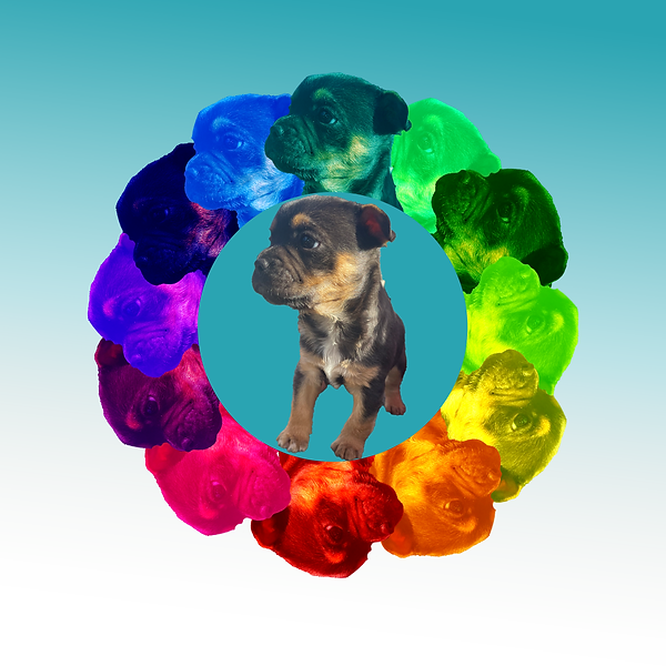
My artwork explores the relationship between color and perception, using vibrant hues to create contrast and depth. By incorporating both traditional and digital techniques in Photoshop, I experimented with layering and blending to emphasize the central subject—a puppy—while surrounding it with a dynamic, colorful arrangement. This piece reflects my interest in how color influences focus and emotion, guiding the viewer’s eye toward the main subject while creating a visually engaging composition.
Color Harmony Mandalas
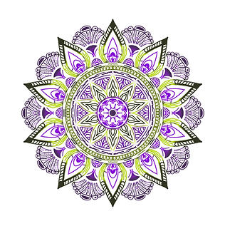
Complimentary
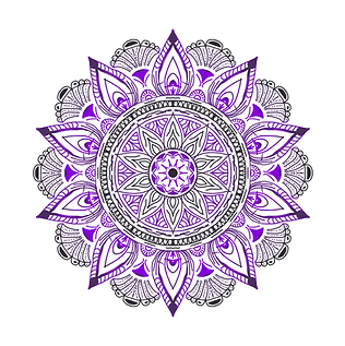
Monochromatic
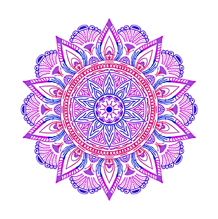
Analogous
For this mandala project, I explored color harmonies to create a balanced and visually appealing design. I experimented with complementary, monochromatic, and analogous color schemes to see how different colors interact.
Out of all the color schemes, I think the analogous one turned out the best because the colors blended smoothly while still having enough contrast. I also wanted to highlight the small details in the design to make the patterns and symmetry stand out.
This project helped me understand how colors work together and how they can create different moods and effects in art.